LunaFit App
OUTCOME
Improved activation, retention, and emotional engagement
FEATURES
Improved Workout Flows and Nutrition Logging, Progress Tracking, New Visual Identity
Problem
LunaFit needed to improve activation, retention, and engagement as users were dropping during onboarding, struggling to build consistent habits, and lacking emotional connection in a saturated fitness app market. Early onboarding created friction, daily workflows felt overwhelming, and the experience lacked a clear, motivating identity.
Solution
To address this, I transformed onboarding into a conversational, coach-led experience that reduced friction and guided users step by step, redesigned core workout and logging flows to be faster and lower cognitive load, and introduced clearer progression loops and emotional reinforcement to support habit formation and long-term engagement. Each intervention was mapped to activation, retention, and emotional differentiation across the full user journey.
Product
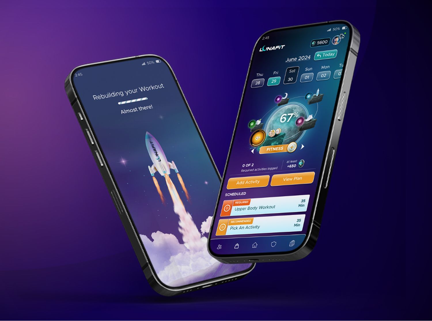
LunaFit is a mobile app within a broader fitness ecosystem that combines gym, coaching, nutrition, and supplements, functioning as a guided, emotionally supportive coaching journey rather than a passive tracker.
Key Features
- Conversational AI Coach onboarding that adapts to users and explains decisions in context
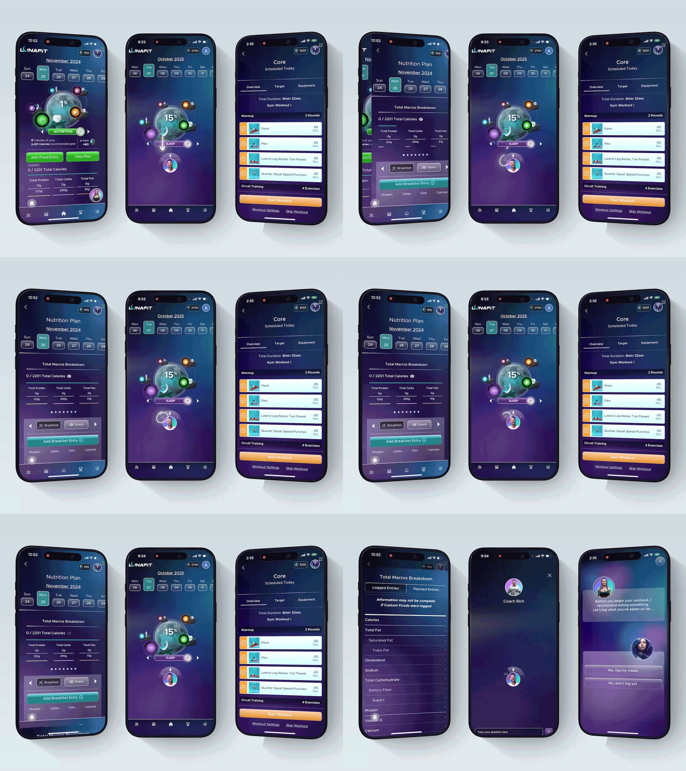
- Streamlined workout player and logging flows that reduce taps and cognitive load
- Clearer information hierarchy and feedback loops that reinforce progress
- Gamification and progression systems that visualize growth through levels and milestones
- A motion-driven, state-based interface built in Rive that makes the coach feel responsive, human, and continuously present
Deep Dive
Seven chapters of building the system
Day 1, week 1
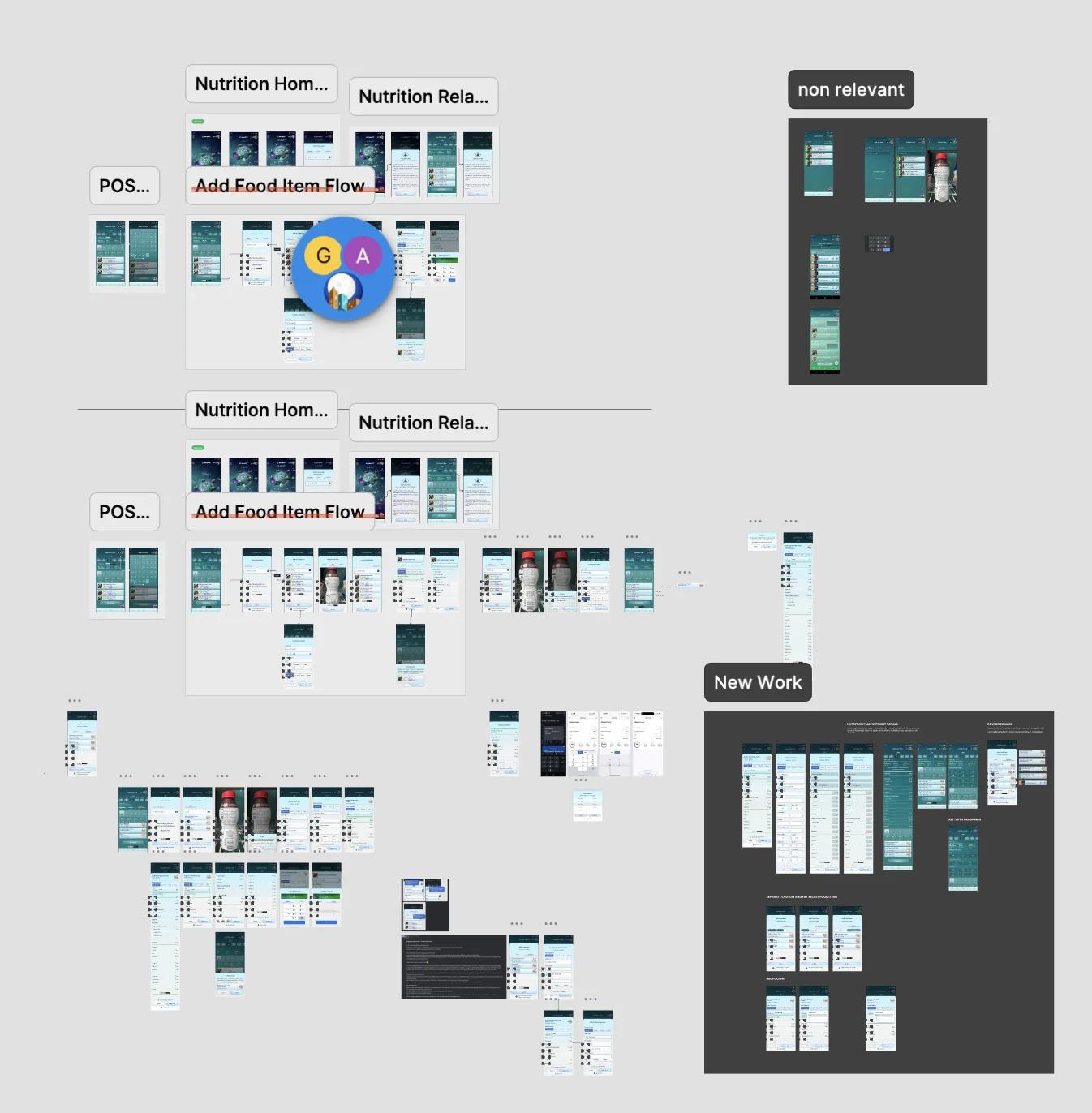
I joined; the previous designer trained me for a week, then left. I inherited 300+ unlabeled frames and a live product.
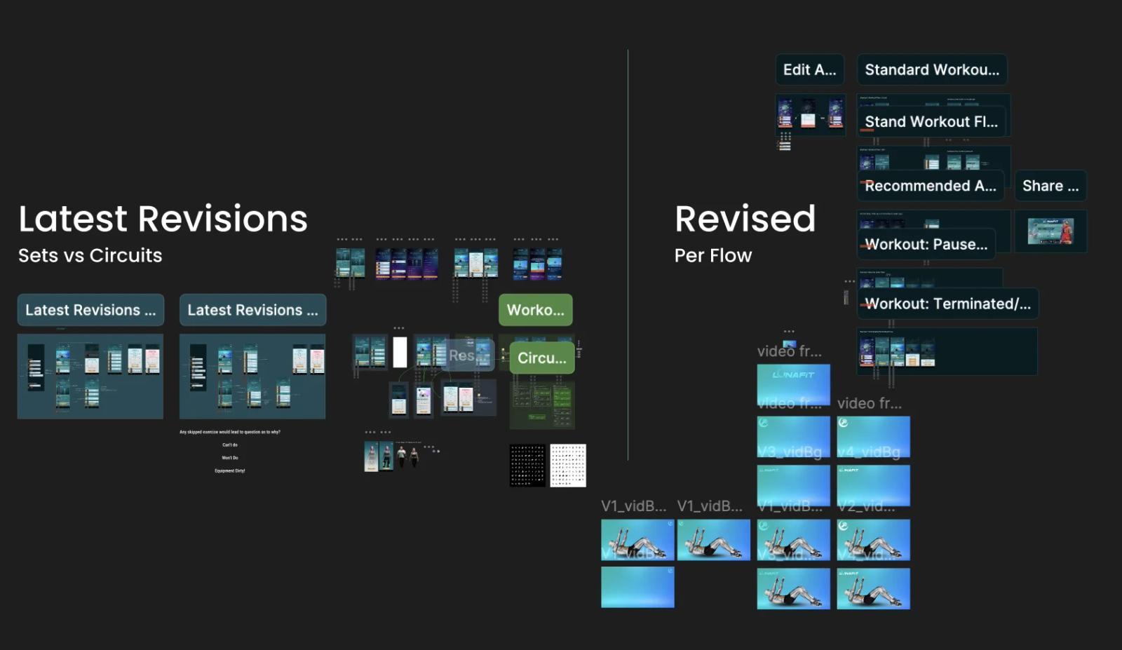
Execute fast, no system
No components, no time to organize. I redesigned screens under visual restrictions, while shipping weekly.
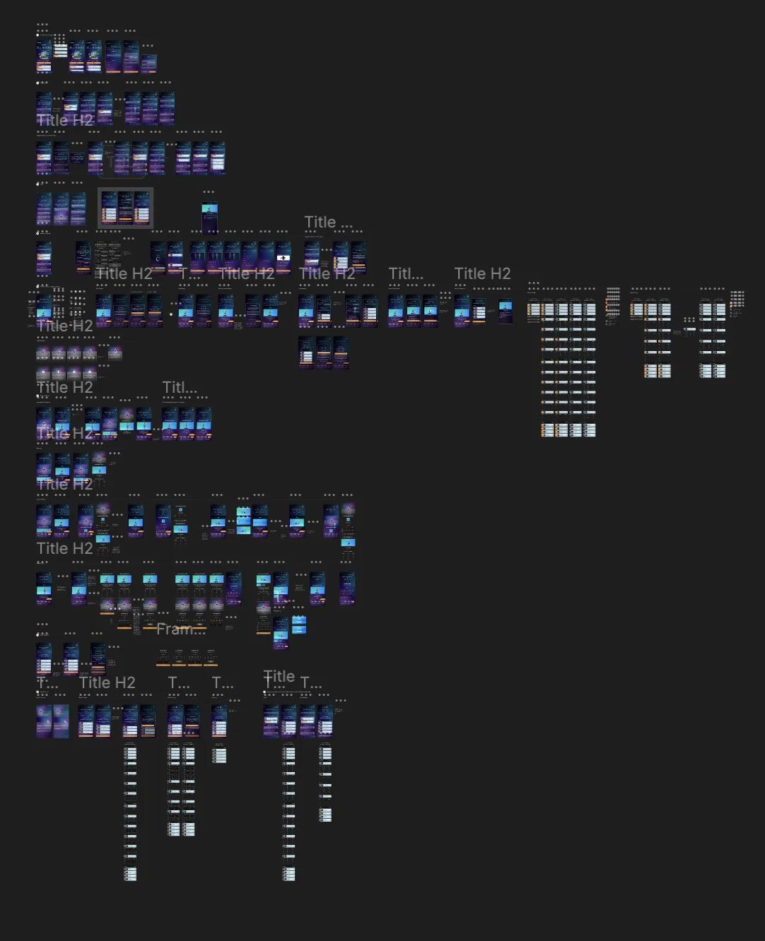
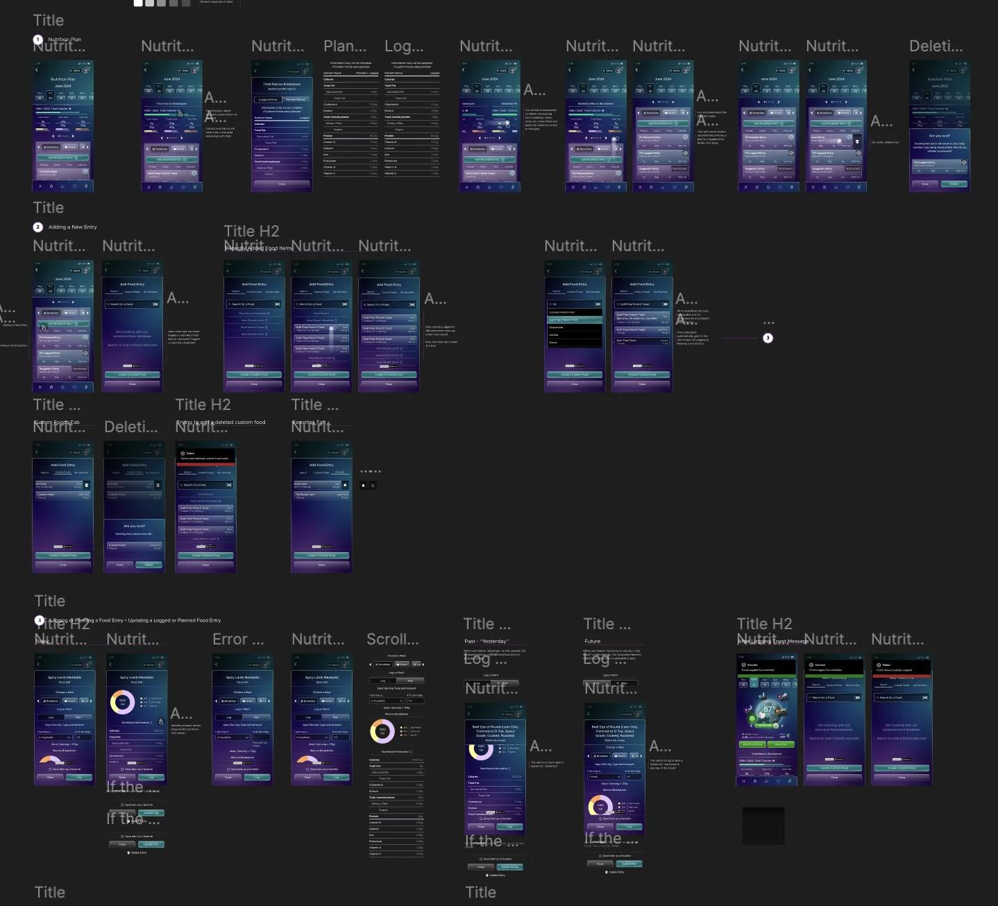
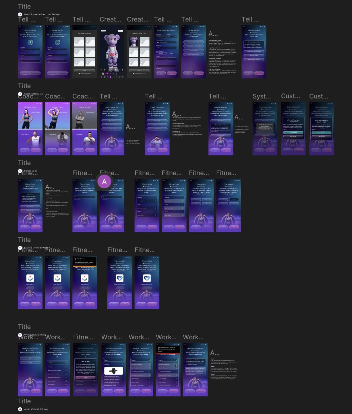
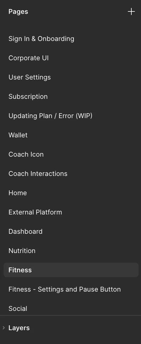
Organize by feature
First pass of structure: screens grouped by feature, labeled, searchable. Not a system yet, but navigable.
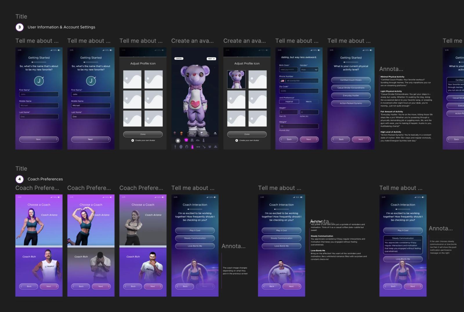
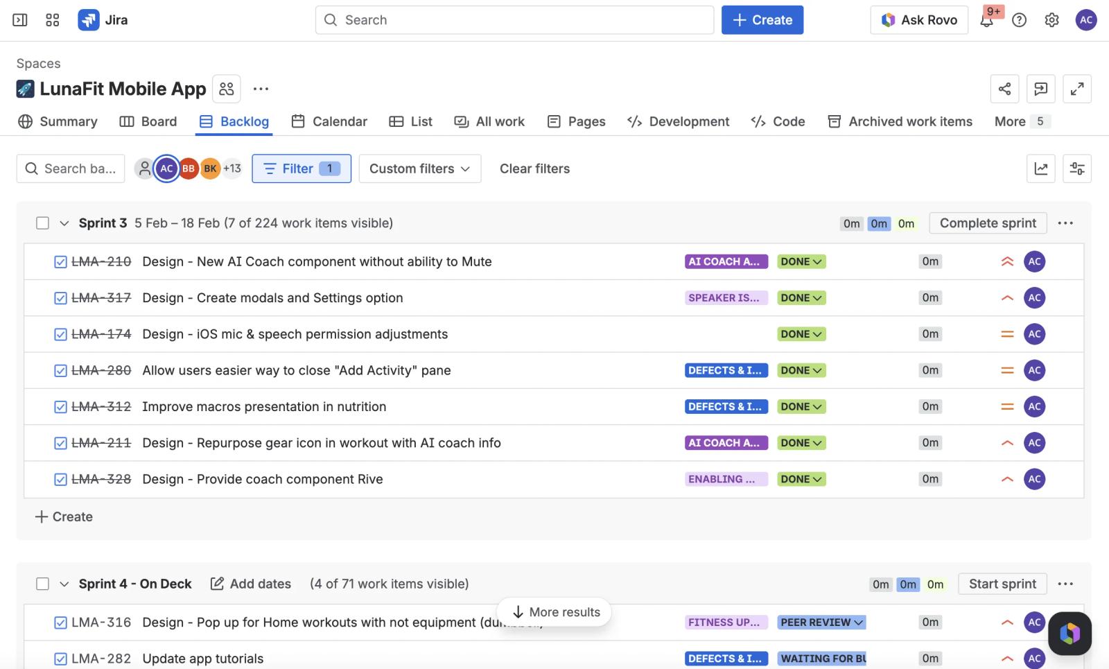
Many hands, many branches
Marketing asks. Investor asks. Dev asks. Stakeholder asks. All landing on one designer at once.
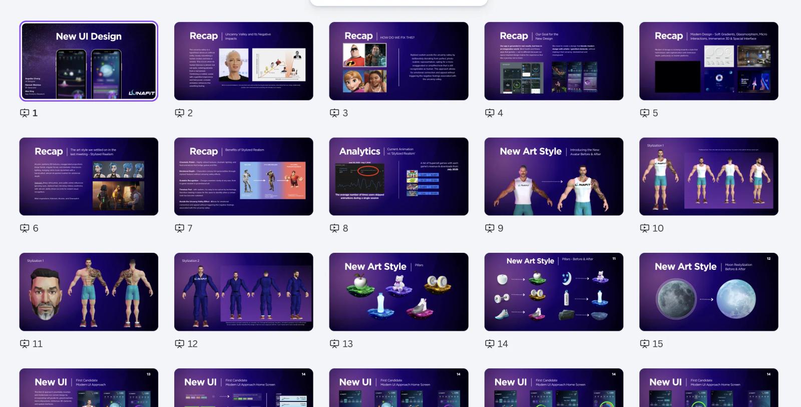
The drift
Over time, what's in Figma ≠ what's in the app. The drift is what forced the next phase.
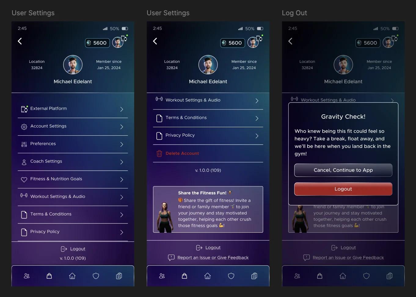
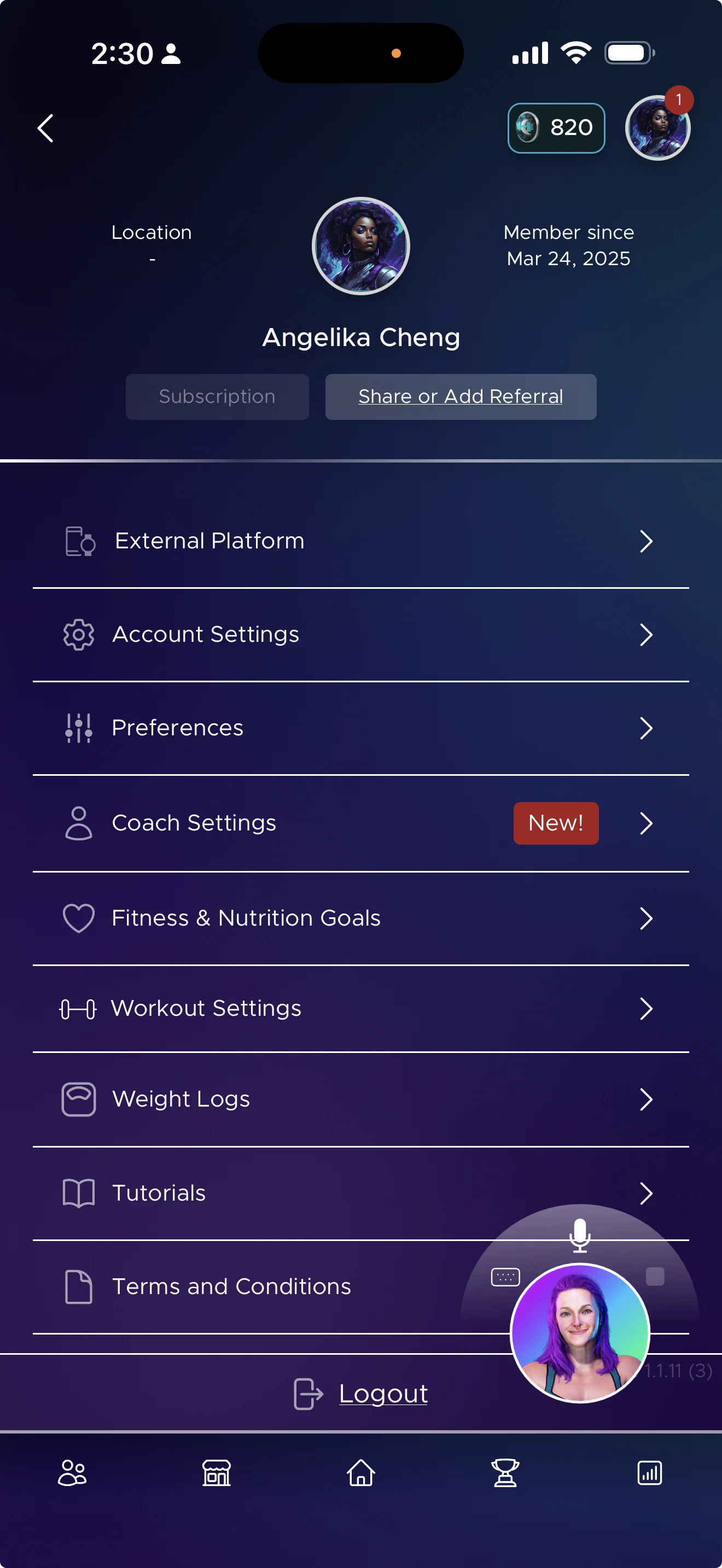
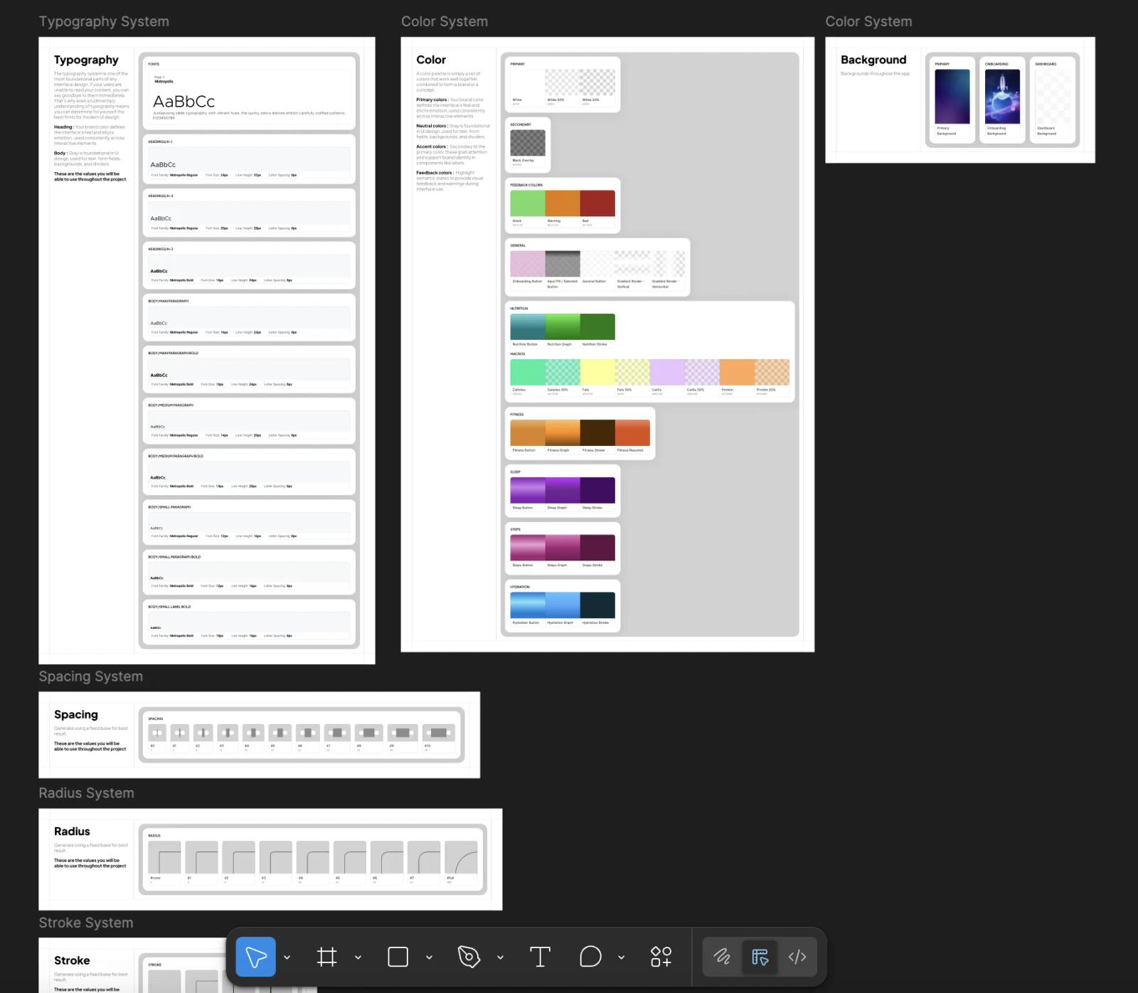
Building a refined component system
Little by little. From screens to components — the Global Recovery System below is one concrete example.
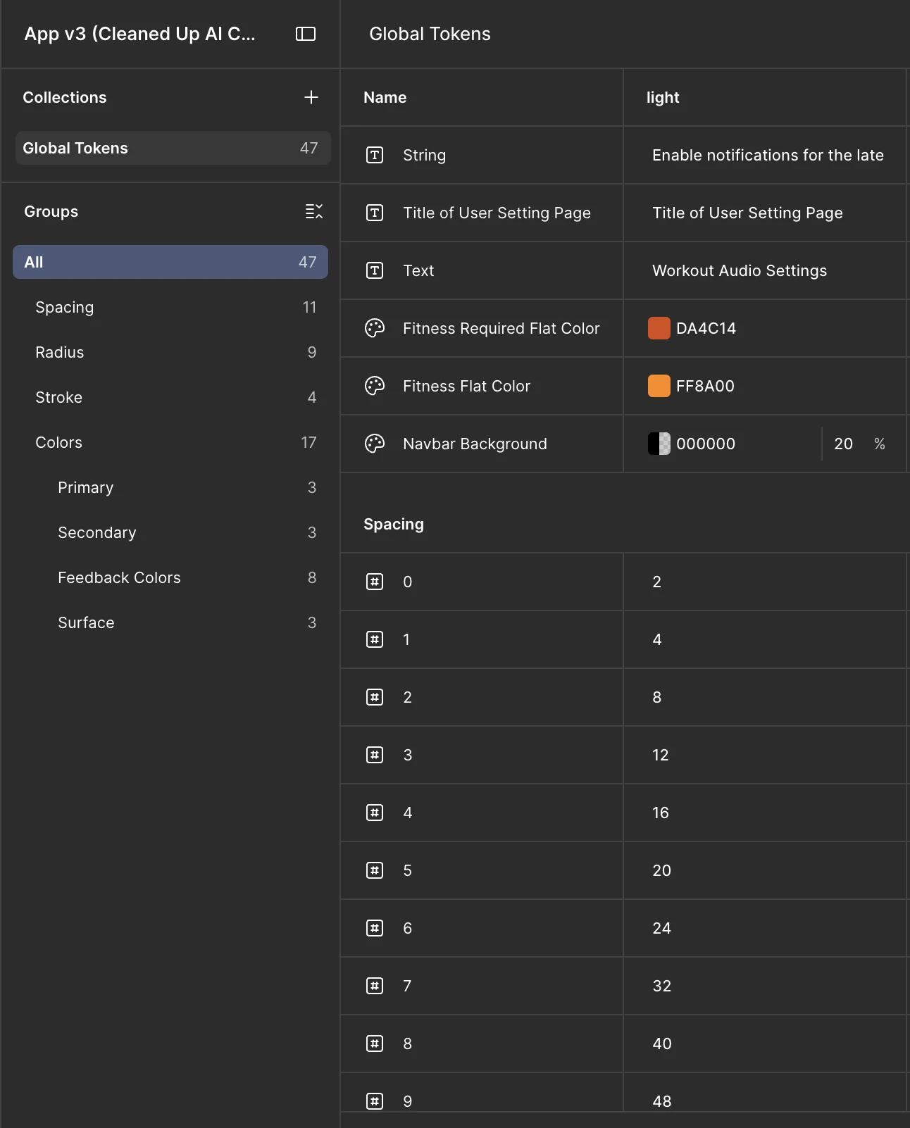
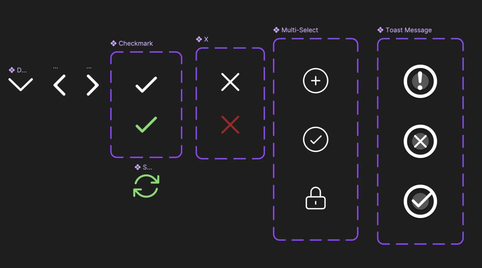
The vision
A token change in Figma propagates through Code Connect, auto-generates a PR, and devs merge. Zero manual handoff.
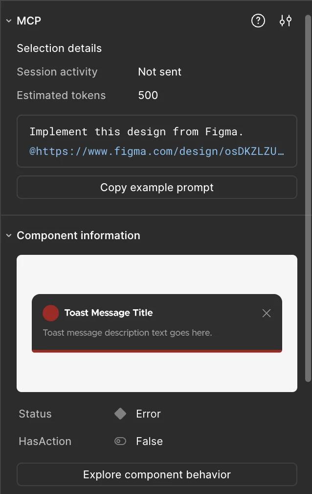
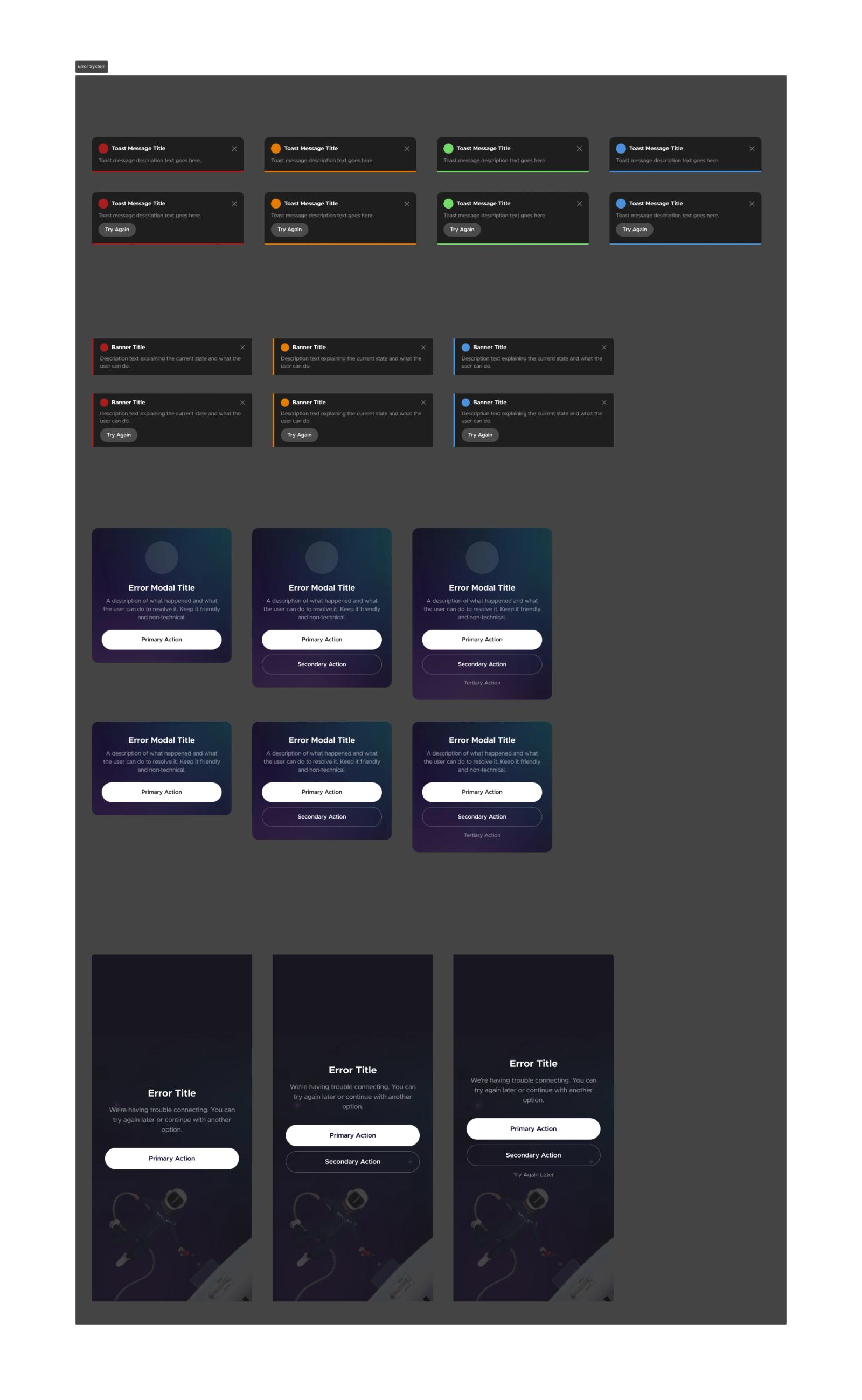
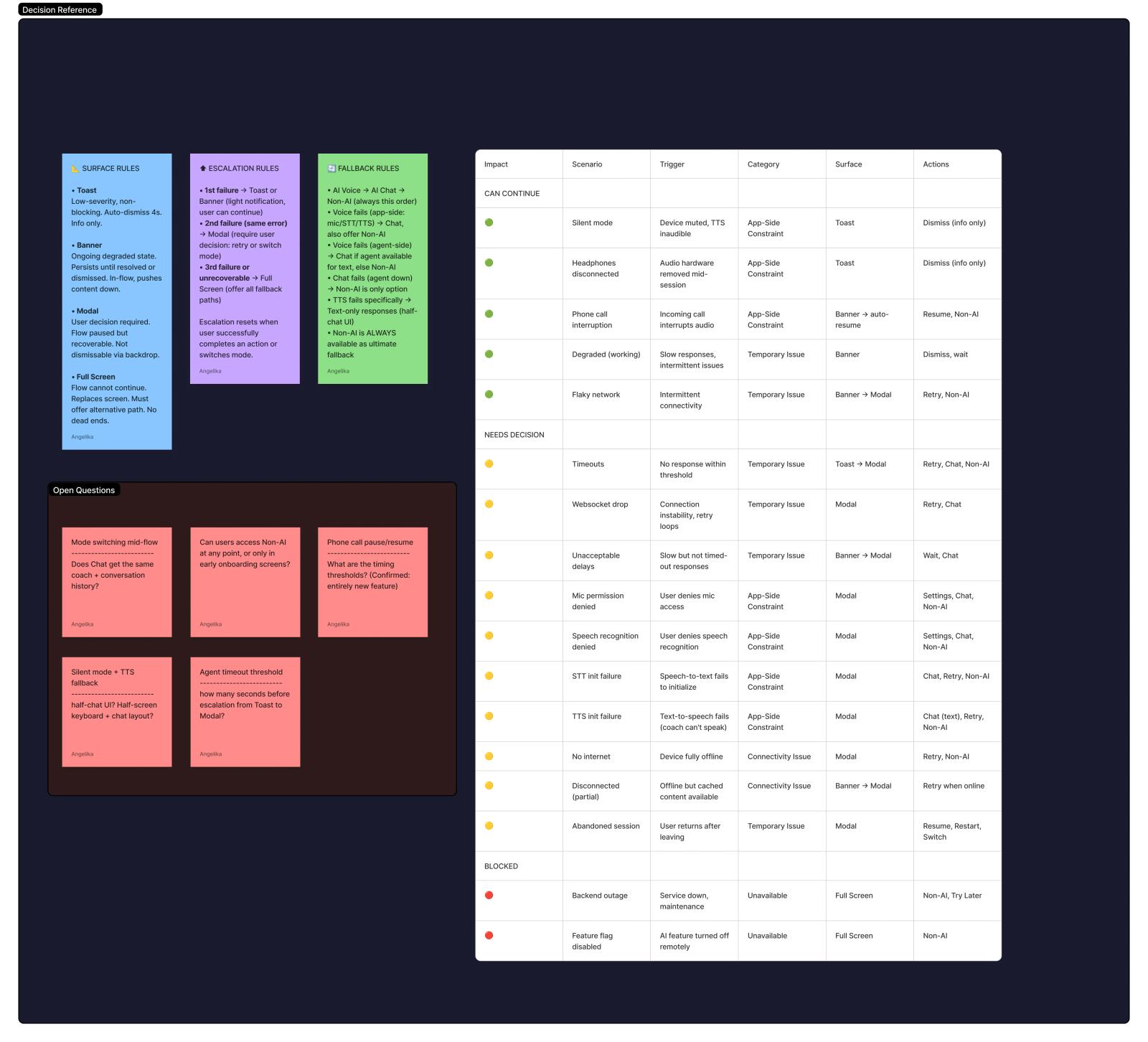
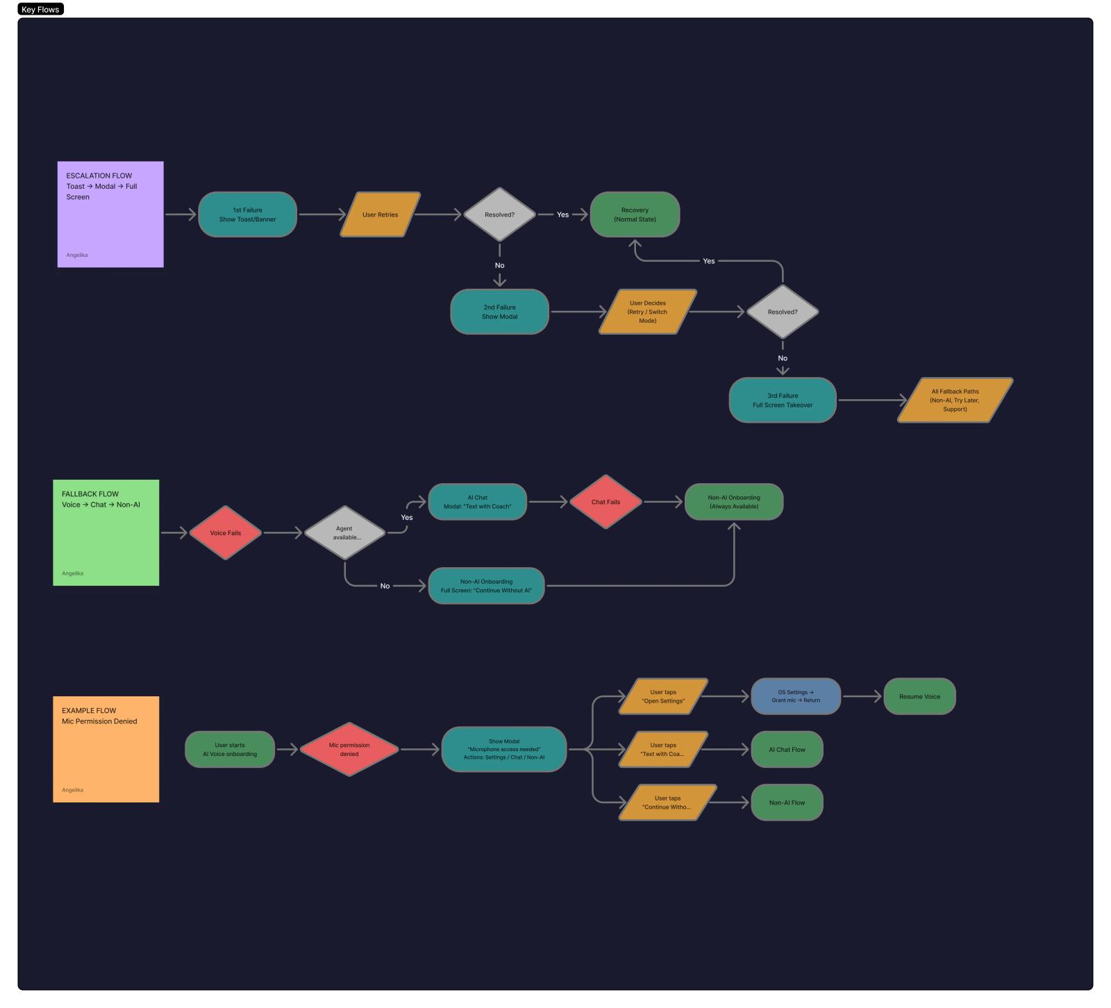
Error isn't a screen. It's a system.
One feature's worth of error and fallback UX collapsed into 4 reusable components. See the design and system flows.
Research & data that shaped the product
Quant
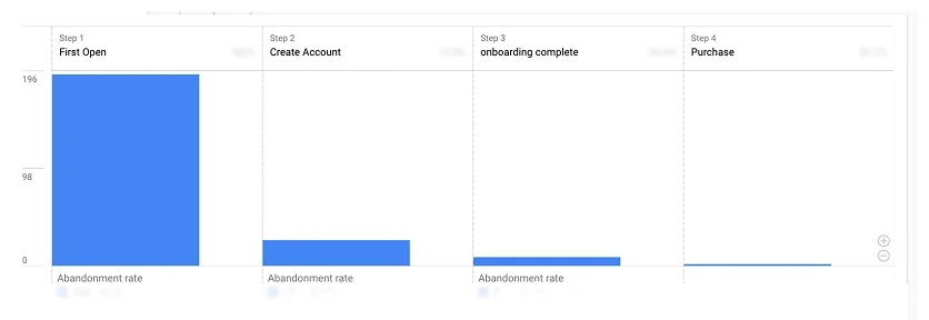
Onboarding funnel
Onboarding required 17 data points upfront, and the biggest drop-off came before account creation.
Quant
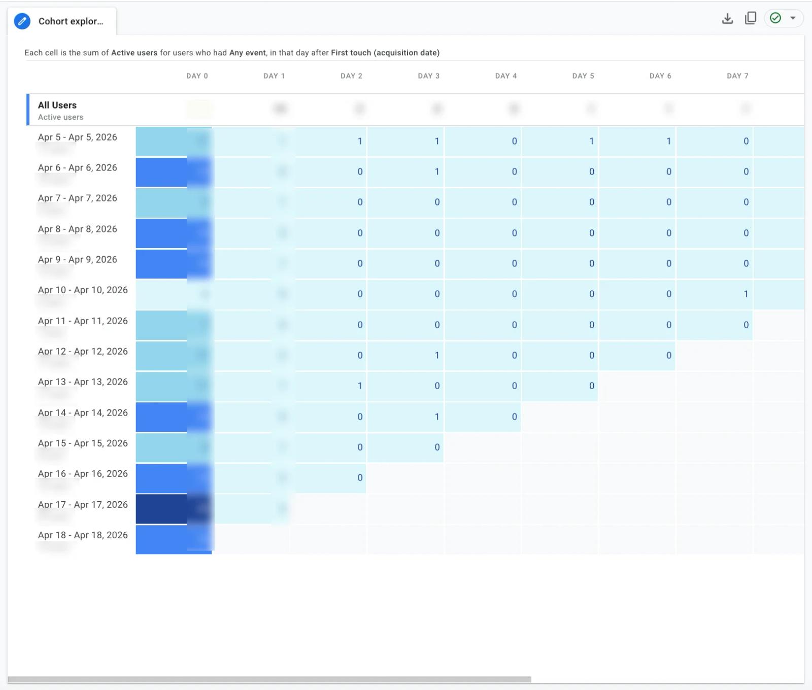
Retention
Retention dropped sharply between D1 and D3, with users disengaging after receiving their initial plan.
Qual
Competitive analysis
Studied leading nutrition apps and analysed user feedback to understand friction in logging behaviour.
Qual
1:1 interviews
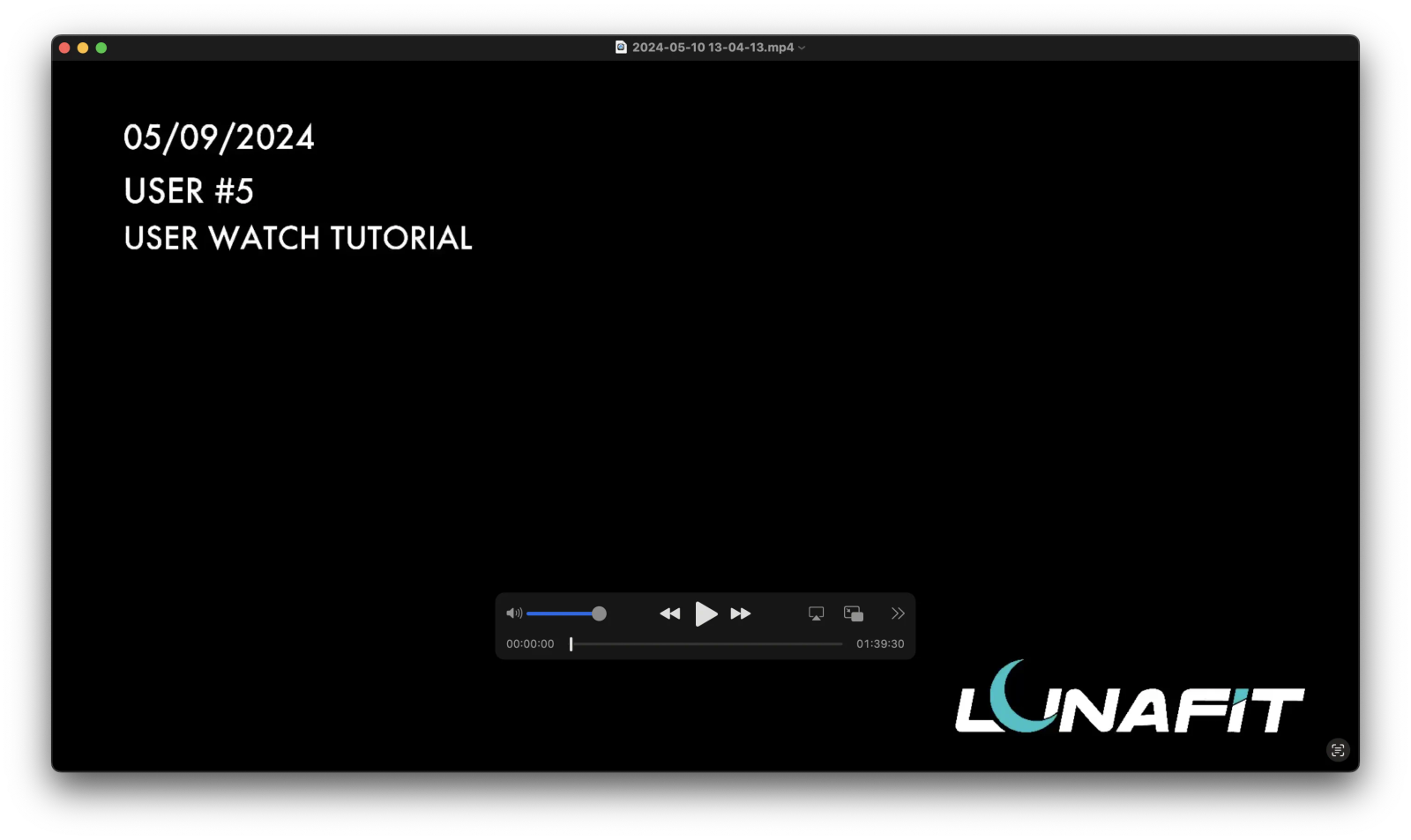
Observed a live workout with a user and saw frustration with an overwhelming, interruptive UI.
Qual
User flows & journey mapping
Mapped the full user journey and found half of users were frustrated by excessive animation and unclear flow.
Quant + Qual
Weight-logging usability test
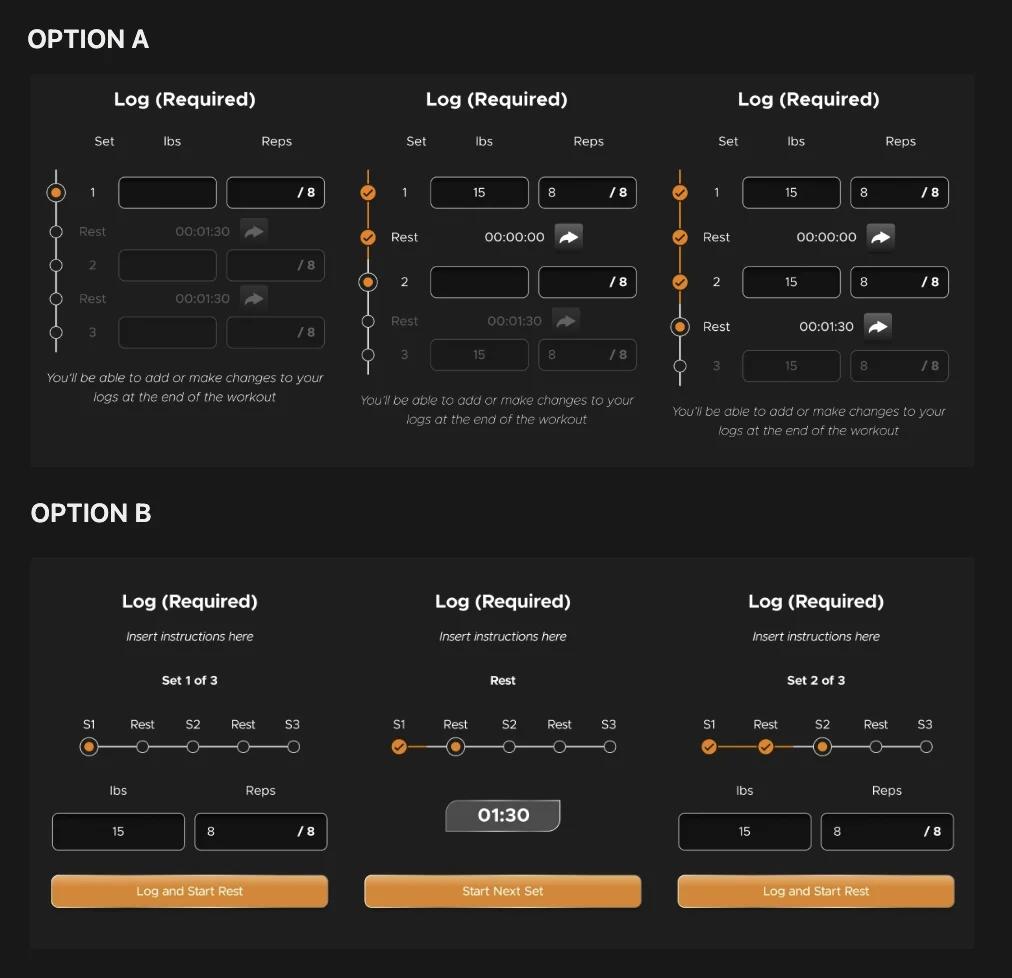
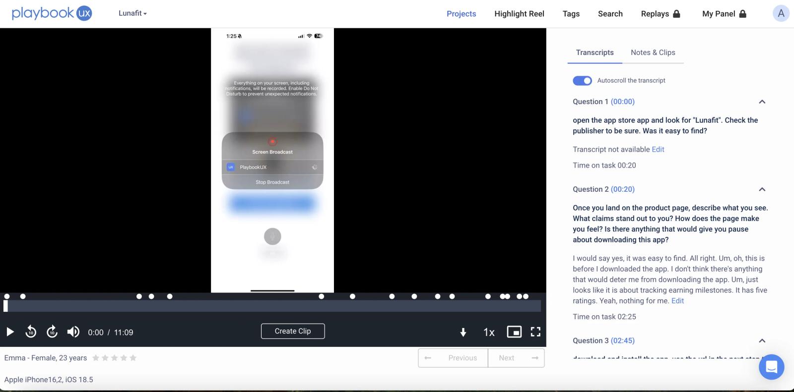
Ran a usability test to evaluate which weight-logging UI felt more intuitive.